Creating a B2B website can be daunting because you want to convey a lot of information at once in a professional manner without losing the visitor’s interest. This is especially challenging because it takes a lot of work to make technical jargon sound exciting.
What is a B2B Website?
A business-to-business (B2B) website is a company website that intentionally speaks to business professionals. Unlike a straightforward B2C website, B2B websites need to target multiple decision-makers from different levels in a company without losing focus or sacrificing relevance.
What Makes a Great B2B Website?
Not all websites are created equal. A great B2B site has a few key things going for it:
- It’s easy to use (no one wants to dig through a maze of menus).
- It nails the “why us” message right off the bat.
- It looks fantastic on any screen, big or small.
- It’s fast — like blink-and-it’s-there fast.
- And it knows how to nudge you with just the right CTA.
In need of more design help? The professionals at our web design company in Houston can turn your website vision into a reality.
If you’re an industrial business, check out our related article for more specific examples of the best manufacturing website design and our guide to digital marketing for manufacturers. You’ll learn about user experience and how to improve your manufacturing company’s SEO.
9 B2B Web Design Examples
Balancing all these fine lines can be difficult, but luckily for you, here are some B2B site examples that you can draw inspiration from! See what makes a good business website to help improve the vision you have for your own brand.
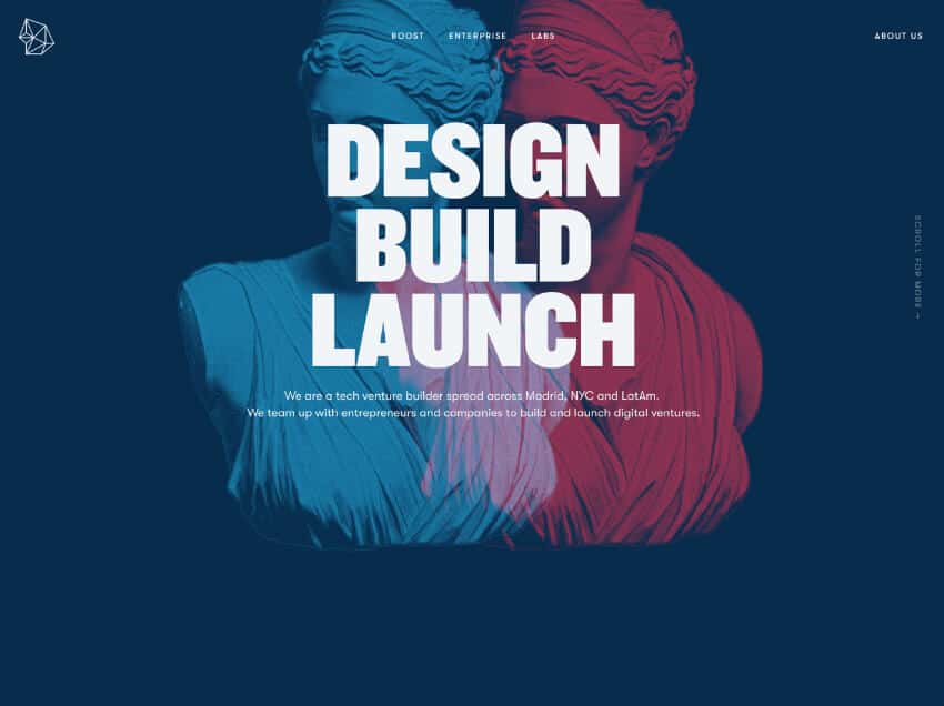
1. Bentobox
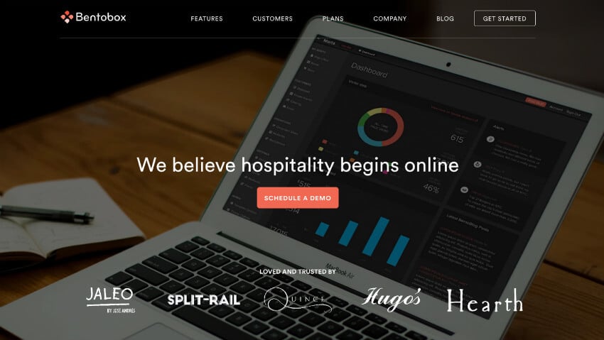
Bentobox follows the mantra that “less is more” by letting their copy speak for itself. A minimalist approach is hard to find in B2B industries where companies often bog website visitors down with too much information on the first page.
Bentobox gets straight to the point with a call-to-action button in the center of the landing page that stands out among the other muted colors. A simpler home page also improves page load speed.
A fast-loading site is important because 47% of users expect a maximum load time of 2 seconds, and 40% of visitors will abandon sites that are still loading after 3 seconds.
2. SpareFoot
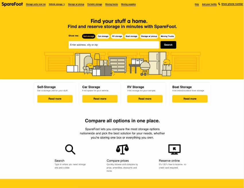
SpareFoot
SpareFoot manages to get away with the text-heavy homepage by breaking it up with a cheeky image and organizing the options to make it easier for prospective customers to choose what they need. Everything you need is neatly organized and just a click away.
Instead of dryly listing all the options they have, they allow you to search the nearest units near you straight from the homepage for quick ease of use. The playful image ties everything together- without it, the website would look quite monotonous and ordinary.
3. WeWork
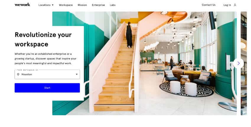
WeWork uses visually appealing pictures of their workspaces to create pleasing displays on its website and showcase available locations to potential customers. The clean and light design evokes a sort of blank slate for your needs, which follows their business philosophy.
Looking for a visually compelling layout on your new B2B site? The web design veterans at MARION’s website design company in Austin have years of experience delivering stunning end results!
One of the most effective design elements in this B2B website design is the personalized location search that automatically pulls where you are. This simple feature makes it easier for both you and the customer by anticipating their needs and getting them to click the call-to-action that much faster.
4. Proof Drinks
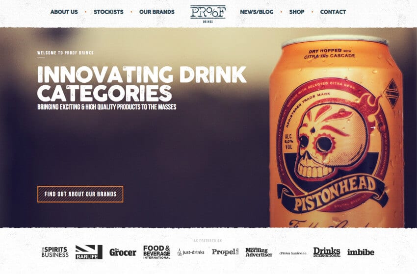
Proof Drinks leans into their edgier aesthetic by prominently showcasing one of their example product brands as the hero image. Their copy supports this decision with words like “exciting” and “innovating”.
If you were a brewery looking for a company that supports creativity, it’d be easy to be drawn to Proof Drinks. Overall, you immediately get the gist that this is a unique company that prides itself on their dynamic culture and philosophy.
5. MOO
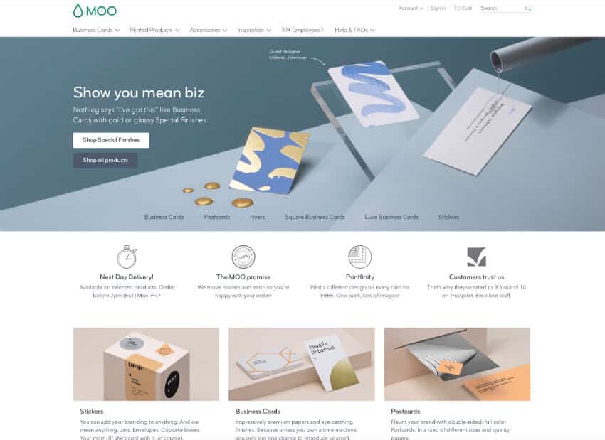
MOO makes the boring art of business card printing look trendy and fun. Their website is a great example of how to transform a traditionally dull service into an engaging and visually appealing experience. The perfectly curated design pulls you in from the get-go, and the casual, conversational copy shows they’re far from your average printing company. Every detail on the site feels intentional, and it’s streamlined to make the entire customer experience as user-friendly as possible.
They don’t just present their services; they make you want to stick around and explore. From the vibrant visuals to the effortless navigation, everything is designed to engage visitors and keep them coming back. Compared to the traditional cut-and-dry printing companies, MOO stands out in every way. It’s not just about getting the job done; it’s about making the process enjoyable while showing off all the details that set them apart.
6. Zoom
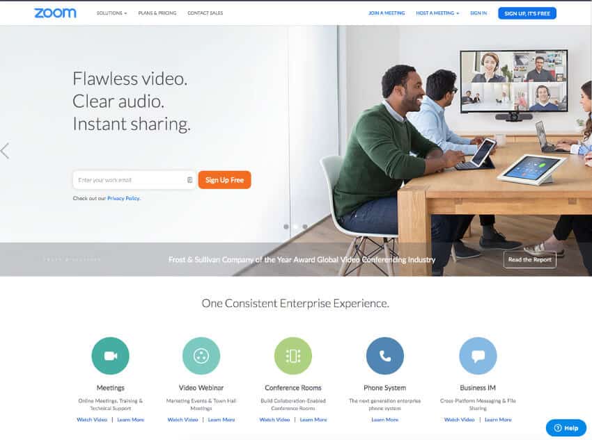
Zoom has a no-nonsense and professional website that gets straight to the point. From the moment you land on the page, it’s clear they’re not here to waste your time. The design is clean and professional, making it easy to focus on what really matters. The copy doesn’t beat around the bush — it’s short, clear, and tells you exactly what you need to know without drowning you in jargon or unnecessary details.
The call-to-action is impossible to miss, letting you sign up or start using the company’s services right away. No digging around or jumping through hoops. Everything about their product and service solutions is neatly organized and presented on one page, so you can quickly understand what they offer without endless scrolling or confusion.
What’s even better is that there aren’t any distracting elements pulling your attention away. Zoom’s site is designed with purpose, just like their platform. It’s straightforward, intuitive, and gets you where you need to go in just a few clicks. It’s a no-nonsense approach that makes the process of getting started feel effortless; exactly what you’d expect from a company that prides itself on efficiency and reliability.
7. Aiia
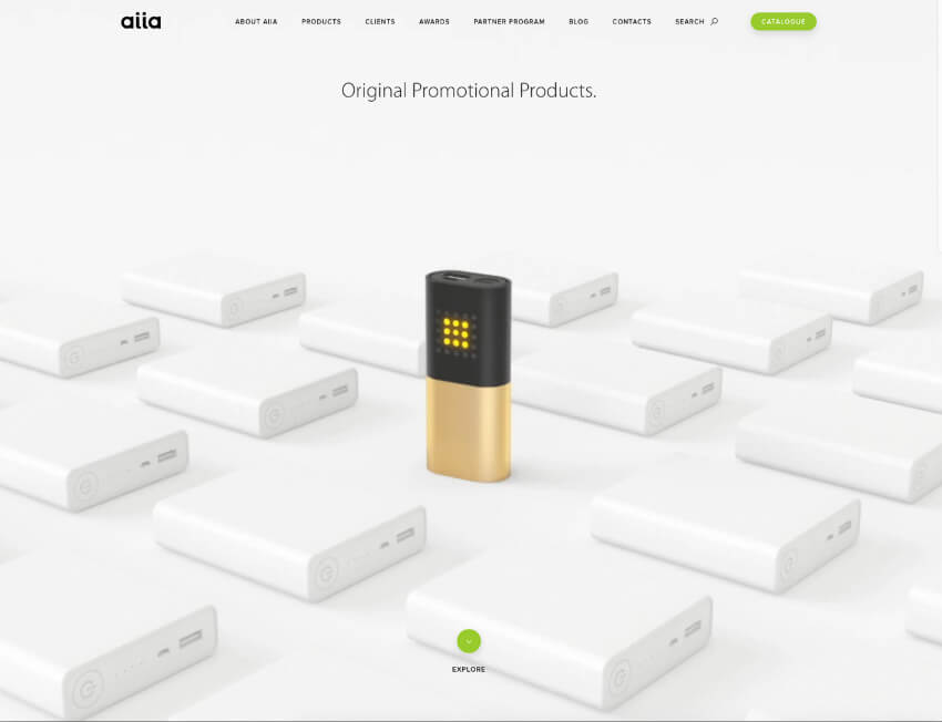
Aiia lets their product speak for itself with an image that takes up the entire homepage. The picture tells the story of their simple tagline, “Original Promotional Products” and shows that their values and products break from the norm.
Aiia’s website proves that sometimes you just need an impactful photo to do all the heavy work. When you scroll down the page, it transforms into a promotional video that showcases their newest and most exciting products.
8. Rocka
As one of the most experimental website designs on this list, Rocka highlights their innovation and youthful energy with a unique background image and bold typography. The modern design is a departure from other B2B websites, which works for newer companies.
If you’re not as established as other companies, a dynamic landing page might catch the attention of a prospective partner. New visitors might be intrigued and want to learn more. Even the best B2B websites can lean towards boring, but you can’t accuse this one of being dull!
9. Pixelgrade
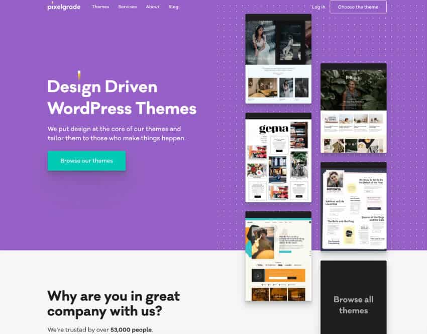
Pixelgrade’s home page showcases its different themes on the right-hand side in a way that makes it “bleed” down, making you scroll further to discover more and read on. The distinctive color scheme also makes it so that the call-to-action button heavily contrasts against the background without being jarring. All the basic design elements work together to create an engaging website.
It’s not just about function; a little flair goes a long way. Think bold color palettes, layouts that don’t scream “template,” and interactive features that make you want to stick around longer. A well-designed site says, “Hey, we know what we’re doing.”
Quick Tips for Building Your B2B Website
Thinking of revamping your site? Here’s the cheat sheet:
- Pick a platform that makes sense for your goals and budget.
- Consider working with pros. DIY can only take you so far.
- Focus on your target audience. What do they need, and how can your site deliver?
Trust MARION with Your B2B Web Design
If you’re thinking, “Wow, our website could use some love,” you’re in the right place. With over 40 years of marketing experience, MARION has the right team to create a visually engaging website for your brand. The strategic approach of our digital marketing agency marries the best user experience and graphic design practices to deliver a revenue-generating machine.
Reach out to our Houston, Austin, and Dallas web design agency, and we’ll show you how to turn your B2B website into your best salesperson. It all starts with a quick conversation. Let’s talk!