
A bad user experience, also known as “Bad UX”, is something probably every company has from time to time. We tend to think of digital interfaces when we think of UX. However, that association derives from the time the term “user experience” first originated in the 1990s, when widespread use of the Internet began.
UX is, in fact, a broad subject that applies to practically any facet of life. For example, here’s a sidewalk as an example of poor UX design:

Keep in mind, though their popularity goes hand-in-hand, there is a difference between web design and UX design – they are not the same creature.
Examples of Bad UX Design
You will discover several bad UX design examples throughout this article. Most of the examples will involve bad UX design websites, as the MARION team has unfortunately encountered these too often in our industry.
We’ll cover some bad website UX design topics like:
Websites with bad UX are still easy to find. It’s no surprise. It’s not easy to devise a brilliant website that meets or exceeds every expectation. Still, some could try a little harder. Below is a rogue’s gallery of bad user experience website examples.
Autoplay Videos
Autoplay video. Think CNN. Think Netflix. It isn’t only that you choose an article or film and suddenly scramble to turn the volume down. You also experience a perturbing lack of control when these things happen. You did not choose to watch anything; the website or app decided it for you, along with the effort of switching the annoyance off.
CNN’s autoplay videos along with its persistent popups in every session begging for email subscriptions make it one of the worst user experience websites.

Hidden Navigation
Making a website or app easy to navigate for everyone should be a top priority. Because modern websites need to fit both desktop and small smartphone screens, the navigation is often converted to a hidden feature revealed only by toggling a button or icon.
Usually, when the width of the screen falls below a certain threshold, the full menu is hidden, and the mobile menu toggle appears. Sometimes, websites resort to hiding navigation on both desktop and mobile screens. How a user interfaces with a product is generally referred to as user-interface, while the whole experience is considered “UX.” Navigation is typically a part of UI and UX, but keep in mind that there are differences in UI vs. UX.
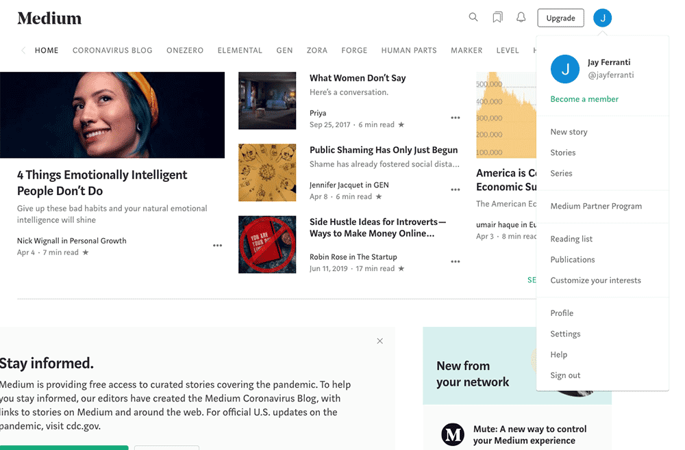
Here’s an example of hidden navigation: Medium.com. There’s nothing to indicate the icon at the top right is clickable and contains many important links.
Usability studies show that this practice can be improved by adding icons that kept in plain view at all times for essential features. Here’s an example of web design that includes effective icons: The Yahoo mail app inbox. Because icons alone are often not enough to help people identify their purpose, a text label is also included.
Difficult Navigation
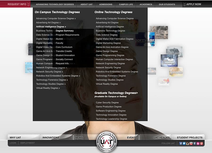
The University of Advancing Technology offers a challenging curriculum. But, to find a course you must first take this eye-test of a multi-layered flyout submenu, in tiny gray text over a black background on their website.
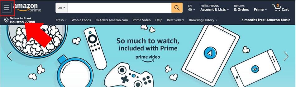
And we all know and love the Amazon header. This combination of usability disasters is incredibly busy and unattractively designed. In the desktop view, you see a horizontal row of destinations, but most of the menu is hidden under the mobile menu toggle.
The menu “hamburger” icon is squeezed into the top left corner. Because it’s fighting for its life in the space provided, the menu toggle is exceptionally difficult to find.
Dark UX
“Dark UX” or “dark patterns” refers to ways some websites intentionally deceive, conceal information, confuse, or attempt to trick the user. To learn more about the many techniques of Dark UX, such as misdirection, privacy Zuckering, roach motels, and others, visit https://www.darkpatterns.org/.
Darkpatterns.org was conceived by Harry Brignull as part of a campaign to raise awareness of dark patterns. Darkpatterns’ twitter feed, @darkpatterns is a great place to expose these shady techniques should you run across any.
Here’s one of the most pernicious examples of dark UX trickery: the giant green download button ads. For the unwary, these buttons trick the user into thinking he’s found the download link for a product he needs. But in reality, they are misleading and possibly dangerous attempts to get the user to do something he did not intend.
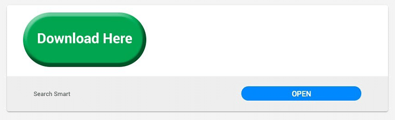
Google has provided policing of this practice and will block websites that display these types of ads, however, they are still in wide use as of this writing.
Discoverability
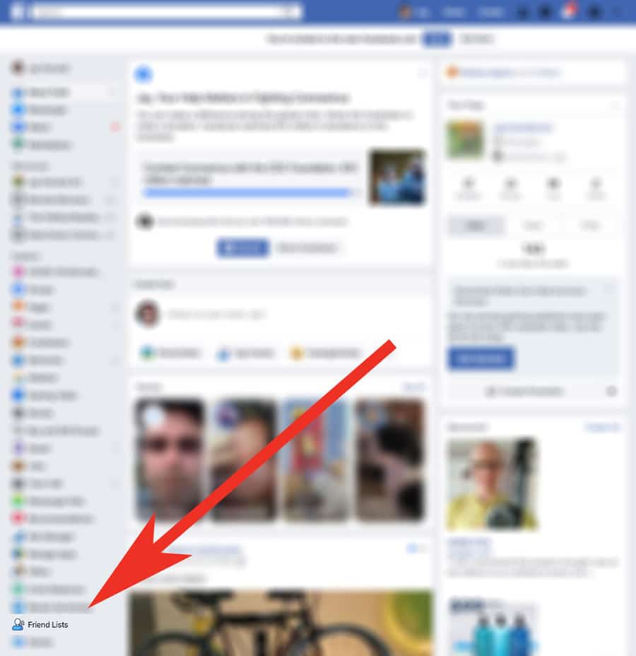
When something is hard to find on a website, it falls under the UX category of discoverability. For example, see the Facebook Friends List, below. The link is hidden in the left menu at the bottom, but only visible after clicking More. Why is it so hard to find? It doesn’t make sense.
Friends are what Facebook is all about. It’s at the end of long list of ugly clip art style icons. The Friends List is not the only hard-to-find option on Facebook. To update your security settings, you may need to consult Google for the latest Facebook security How-To.
Performance
Probably the most serious of all usability issues is a slow loading website. It’s the most serious because it’s the one that will prevent someone from ever seeing your content. Many usability studies show that websites that take more than 2 seconds to load have high bounce rates, that is, the user simply chooses not to proceed to the site at all. Enlisting the help of a quality SEO firm is one way to combat slow load times.
We checked performance of some well-known ecommerce sites and were surprised to see this major retailer receive a grade of 4 (out of a possible 100) for its mobile experience. The desktop experience was not a lot better at a grade of 15. Frequently, taking some simple configuration steps will help improve website load times.
Get help from our SEO agency in Austin if you’re struggling with slow load times!
Get Quality Design with Help from MARION
While our article mainly concerns digital UX, naturally, at MARION, we are concerned with good vs. bad UX design in everything we create for our customers, whether it’s a website, a business card, brochure, or box!
Our Houston, DFW, and Austin web design team and marketing strategists are at your fingertips. Contact us today to schedule a free consultation!