One of the often overlooked and under-discussed topics of web design is the amount of time, effort, and money some companies put into building websites that are simply not effective. But, what makes an effective website?
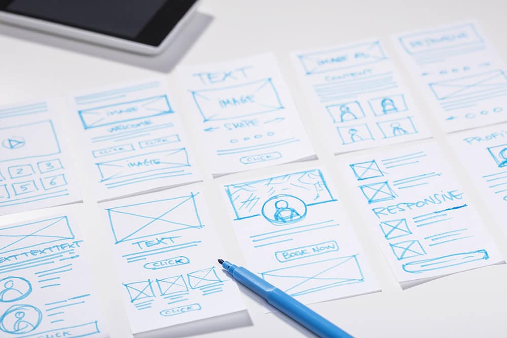
There are many elements that make up a website design. These elements vary in importance. A truly effective website will ensure that the most important aspects are fundamentally solid while allowing for leniency in terms of personal preference or aesthetic choices.
In my previous post on the subject, we discussed the importance of branding for your website. Branding is an important element of your website design but is primarily focused inward on your company and how it is presenting itself. Contact a professional branding company in Houston for more tailored branding guidance.
In this post, we’ll approach your website design from another vantage point and discuss usability. While the result of good branding primarily benefits your company, usability is aimed more directly at the users who are visiting your website.
Of course, when we discuss how users interact with your website it should go without saying that a positive experience is good for your company and a negative experience is bad. So, while we will be discussing concepts in terms of whether they are good for your user, you can assume that if they are good for the user, then they are good for you.
Usable vs useful
Usability is a term that we use in the web design world to discuss the quality of a website in relation to how easy and natural it is for a user to understand, navigate and more broadly use your website.
I think that it’s important to distinguish at this point the difference between a website’s usability versus its usefulness. A useful website can offer terrible usability, and a website that is not terribly useful can offer great usability. The two are not mutually exclusive.
You can tell the difference between the two fairly easily by simply examining the experience you are having. Here are two scenarios to consider:
- You frequent a website to gather important information about a topic on a regular basis despite continued frustration in initially finding the information that you are seeking.
- You find a website through search that appears to offer information on a topic but after navigating the website in a number of different, but intuitive, ways you determine that the information you are looking for is not on the website.
In scenario one, you have a useful website that offers poor usability. In scenario two you have a usable website that is not useful.
You’d be better off owning the website in scenario one than scenario two, but neither website is optimal.
Ideally, your users would find your website useful and easy to use. It’s that simple.
What makes a website usable?
A number of factors are considered when determining usability. It will vary slightly in the terms used to describe the concepts, but in general, there are five key areas to focus on, which the Norman Neilson Group does a great job of laying out:
- Learnability: How easy is it for users to accomplish basic tasks the first time they encounter the design?
- Efficiency: Once users have learned the design, how quickly can they perform tasks?
- Memorability: When users return to the design after a period of not using it, how easily can they reestablish proficiency?
- Errors: How many errors do users make, how severe are these errors, and how easily can they recover from the errors?
- Satisfaction: How pleasant is it to use the design?
As you can see, when we examine usability we are looking at a website design from the perspective of the entire lifecycle of a visitor.
We probe into initial interactions, common issues while interacting, the user’s ability to use the site again after leaving it for a period of time, and even how the site makes them feel.
I love Amazon’s website. For me, it is like a beautiful symphony, only one that generates a ton of revenue.
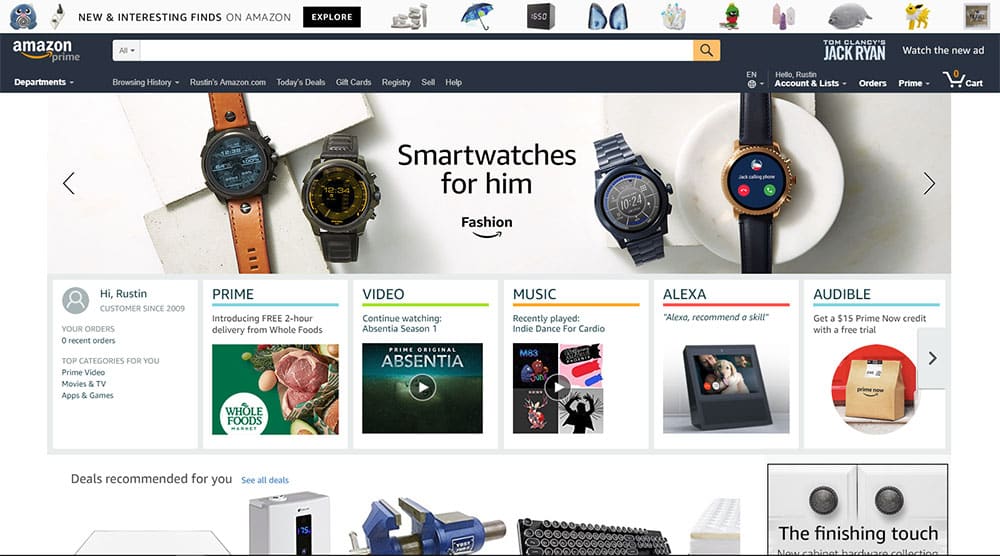
If you look at it from a usability perspective, it’s fantastic. What do most people do on Amazon? They search for a product. So, search is prominently displayed center top and largely at that.
Alternatively, people browse, so we have all sorts of fun ways to browse that cater to every type of person. It is a usability masterpiece.
All of the key concepts of usability are interwoven into the fabric of your website design and affect every aspect of the user’s experience.
For example, if a website is complicated to learn how to use, it can be expected that users will also struggle to remember how to use it the next time they visit, even if they had it figured out the first time.
Struggling to operate a website like this is inevitably going to frustrate the user causing their satisfaction with their website to go down as well.
Luckily for us, the world wide web is no longer in its infancy, at least not from this perspective. We’ve got loads of data and examples of good usability to steal borrow from.
Don’t make me think
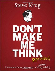
If there were a bible for web design, my vote would be for “Don’t Make Me Think!” by Steve Krug. In fact, I’ve already written a post on this simple web design rule if you want to dive a little into the principles he lays out.
For the purposes of this post let’s just discuss it from a high level. It’s pretty simple really, whenever and wherever possible take the opportunity to actively not make a user think about interacting with your website.
Do you have a cool idea about how you could display the navigation section on your website? Well, if you do, I’m sorry to inform you, it’s probably a bad idea.
Users are accustomed to website navigation and making the “cool” change will most likely negatively affect one or all of the five key concepts of usability.
For example, you might think “Let’s put our navigation vertically on the right side of the page. No one does that; it’ll make us stand out.” To be honest, you’d be both right and wrong.
You’d stand out, but not in a good way. Over the years we’ve learned, however subconsciously, that website navigation can be found horizontally at the top of the page or vertically on the left side of the page. Changing that will only frustrate your users.
Let’s look at four common ways that you can ensure that you’re at least covering your usability bases.
1. Keep that navigation top or left
We’ve already touched on this, but let’s reiterate it’s importance. To do so, let’s refer back to that masterpiece of web design, amazon.com. Only this time, let’s look at an interior category page.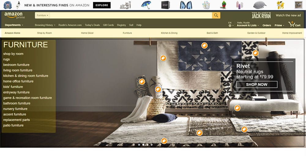
Anywhere you want to go on the entire Amazon website can be reached by using only the highlighted areas. Try it out for yourself.
By using the websites that we do, we’ve signed a social contract that says “we agree to look first to top or left of a website for navigational elements.” Don’t overthink this, keep it simple and keep your users happy.
*It should be noted that there is one glaring exception in the case of blogs, which commonly provide post navigation and searching on the right side. There is a reason for this and it’s a long one, so, for now, we will just note this as an exception.
2. Button should look like buttons
There, I’ve said it. For some reason, people want to get creative with buttons. Buttons are not art projects; they are design elements that are intended to, by their very nature, entice you to click them.
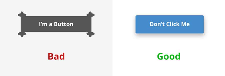
Which of these buttons are you more drawn to click? Yeah, exactly, the one that looks like a button. Extra credit if you noticed that despite what the buttons say, you’re still more inclined to click it, which brings us to our next point.
3. No one is going to read that
There have been studies done trying to understand why more people don’t sign up to be organ donors when they renew their driver’s license. It’s easy; you just check a box that says something to the effect of “Yes, I want to be an organ donor.”
The answer that they found consisted of two things, A) people are inclined to stick with the status quo, and B) people don’t read!
When the question is switched with one that reads something like “No, I do not want to be an organ donor” roughly the same number of people checked the box, and voila, more organ donors.
I see the irony in writing about the fact that people don’t read, but it’s true.
So, if you’re faced with a situation where you have a possibly confusing area or element on your website and your answer is to put instructions there, you’ve pretty much guaranteed a bad user experience.
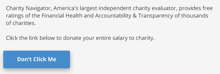
Despite the fact that I have provided instructions that clicking this donate your entire salary to charity, a surprisingly large number of people would click it because they didn’t read the instructions.
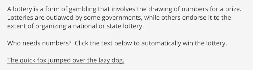
The same is true with this example, except now we’ve deprived people of their lottery winnings by not visually representing the button very well and by assuming that they will read the instructions above it or much of anything for that matter.
4. Use headers, lists, and visual cues
Have you read every word of this post to this point? For most of you, the answer is no. As much as I’d like to think my writing is so engaging that you couldn’t bear to skip a single word, I know otherwise.
The fact is that, similar to not reading much at all, when we do read people tend to be skimmers. It’s just how we are wired. We want to get to the meat of the subject without having to go through the pain of reading the surrounding context.
You shouldn’t fight this; you won’t win. Instead, make it easier for a user to find what they are looking for, and they will be more inclined to think that your website is useful… which you will remember from reading earlier in the article… something you definitely read and didn’t skim past, right?

Also, whenever possible, include images, videos, or even gifs. They make your content more visually interesting and engaging.
The Take-Away
Usability may be the most important aspect of your site’s design when determining how effective it will be. The good news is that any reputable Houston web design company will design these elements into your site almost by force of habit.
I hope that the real takeaway from this post is that you have gained a new perspective for judging the quality of the websites that you use.
Sure, a website may not be the most aesthetically pleasing site you’ve ever used, but if it is providing you with useful information in a way that doesn’t make you stop and think about how to use the site, the design is doing an awful lot right.
If you have concerns about the usability of your website, give us a call, and we can discuss it together.
