
Imagine a motivational speech or sales presentation in which every word was spoken without a pause or change in tone. Would the speaker’s message be interesting or memorable? Would you be persuaded to buy their product or excited to pursue their advice?
Even if the speaker really believes the product or information he’s promoting is valuable or even life-changing, we might expect the only visible results of his uninspiring efforts to be heavy eyelids and bobbing heads.
In this post we’ll discuss emphasis; what it is, why it’s important, and some common dos and don’ts when trying to incorporate emphasis into your designs.
What is emphasis?
We use emphasis to draw attention and create a focal point. Emphasis is achieved by minimizing or toning down compositional elements while accentuating other elements in order to bring attention to the focal point.
When you go to a museum full of art, would you expect to see the same bland color used on every single painting? The absence of variety produces a dull uniformity. Yes, beauty is in the eye of the beholder, but, how would you honestly critique such uninspired work?
Sometimes, in an effort to avoid monotony and add emphasis, nearly every pixel on a webpage or every square inch of white space in a brochure is packed with graphics and content, leaving a busy, eye-crossing patchwork of imagery and text that is difficult to navigate. Using emphasis in graphic design is vital in creating a compelling design that communicates a message. Emphasis in design can be accomplished in many different ways.
For help creating the appropriate emphasis in your design, let graphic design agencies in Austin like MARION lend an expert hand today!
Emphasis Dos and Don’ts
When attempting to add emphasis to a design, consider the following dos (or don’ts):
Don’t: Make the logo too big.
![]()
Unnecessarily increasing the size of a logo is a very common request—and we get it. You’re proud of your logo, and you should be. It identifies your business, and you don’t want to be overlooked.
You want to be recognized, but your logo is only a small part of your brand. Increasing the size of your logo may come across as visually shouting, or, an act of desperation to be seen and stand out from the crowd.
On the other hand, a legible and tastefully sized logo conveys confidence and approachability. And don’t discount the importance of other design elements in addition to a logo in the quest to get noticed and communicate a message.
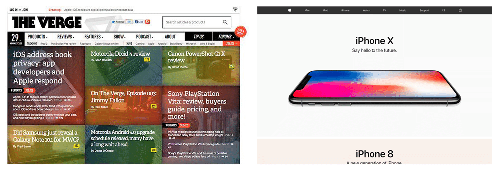
Don’t: Add too many or irrelevant pictures.

You want potential clients to know all about the products and services you offer, but, using more photos may not be the answer.
Overwhelming a potential client with imagery may come across as aggressive, and, a visually cluttered design may hinder your marketing efforts by causing more confusion than clarity.
Consider the effectiveness of fresh, clear designs used by successful and influential companies like Apple or Coca-Cola. The most successful companies use attractive, well-thought-out images in limited numbers to support compelling messages that drive people to their products and services. This is the essence of successful marketing.
Do: Choose font-sizes carefully.
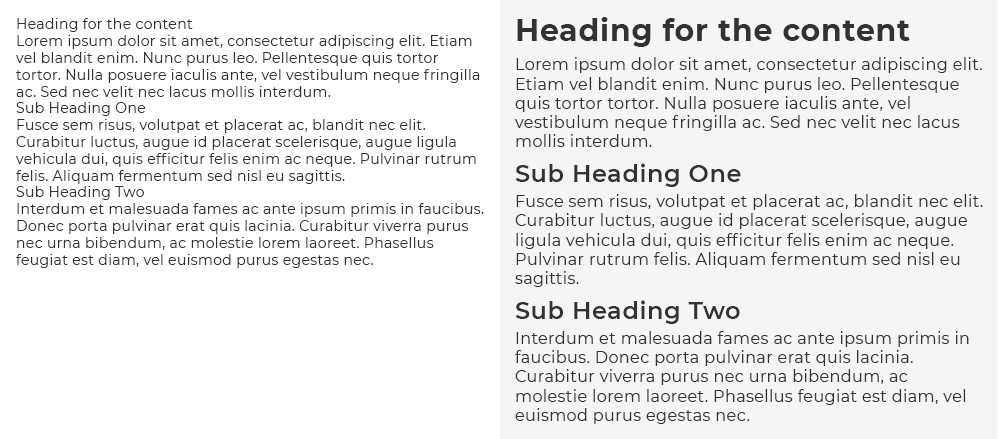
Readability is one of the most important parts of a successful design. After all, if your content is hard to read your message gets lost, no matter how exciting or useful it may be.
A clearly legible font size ensures usability for most every user across multiple platforms. But, to help ensure readability, there should always be a clear distinction between headlines, subheads and body copy—also known as typographic hierarchy.
Helping a reader navigate by arranging and organizing type in a clearly established pattern is as important as using a legible type size. This allows the reader to determine the most important parts of a design quickly.
Do: Use plenty of color, but thoughtfully.
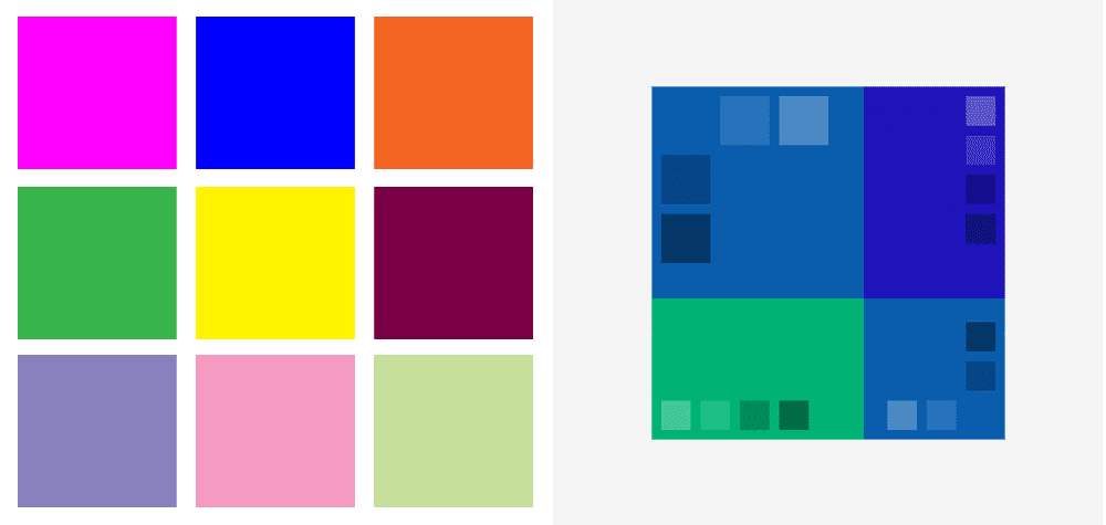
Calm and soothing; Passionate and daring; Warm and welcoming. Choosing the right color scheme can have a significant positive impact on the desired mood and perception of a design.
An average design can be brought to life by using the right color, not necessarily more color. Just like adding more photos to a composition, randomly adding more color can become a distraction and may have the same adverse effect in communicating your overall message simply and effectively. When using color for text it should be easily readable, inviting, and easy on the eyes.
Don’t: Fear the white space.
White, or negative, space can be defined as the area of a design that is left blank or unused for text or graphical content.
It’s simply the space between elements of a design. Filling white space with text and graphics can lead to user confusion and visual fatigue.
Conversely, the proper use of white space, along with other basic graphic design rules, can be very impactful in creating a sophisticated, elegant design and clearly communicating your message.
If everything is emphasized, nothing is emphasized.
One of the most important rules to follow in design is this: If everything is emphasized, nothing is emphasized.
Emphasis is needed to direct and focus attention on the most important parts of a composition, speech, website, or a piece of marketing collateral.
The proper emphasis in design is accomplished using structure and direction to help guide the audience through the design. And visual interest can help accomplish the most important goal of your marketing efforts—communicating your message in a simple, easy-to-understand way, and ultimately driving customers to use your products and/or services.
The Take-Away
Great designs are not created by focusing only on the content of what you are designing or by giving no consideration to the content of what you are designing.
In reality, effective designs are created by giving careful consideration to the content of what you are designing and creating a visual hierarchy that is both appealing and helpful for the end user in their efforts to consume the content.
If you have concerns that your designs are not as effective as they could be, consult an experienced graphic design company to help you identify areas of obvious deficiencies.
Finally, never be afraid to ask a designer why they have made the choices that they have, they should always be able to explain why their choices will help the end user use the piece more successfully.
