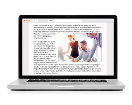
How Much Does A MARION Website Cost?
The cost of a website design project depends on the size and complexity of the site. The average website we build is between $5,000 and $15,000. Companies with more aggressive growth goals, advanced customization requirements, or complex needs may even plan to invest more than $15,000 on their website.
Most Websites We Build Include:
- Custom user-experience design focused around your marketing message
- Professional content audit and development
- SEO-friendly website design and setup
- Optimized conversion funnel, including calls-to-action, landing page(s), and conversion form(s)
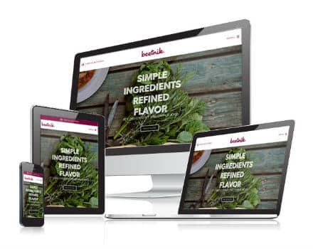
- Responsive layout for cross-device usability
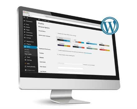
- Best-in-class content management system (WordPress) for easy updates
When Will My Web Design in Houston Be Done?
The MARION Website Design Company in Houston will typically complete your website in around three months.
Different variables that will affect the completion date include the number of pages on your new site, and whether you plan to use existing content or newly written content. If you opt for new content, our team of content marketers and SEO professionals ensure that your pages represent your brand AND perform well. The goal is to have an attractive website that consistently drives relevant customers into (and through) your sales funnel.
Explore Our Houston Website Design Blog Posts for More Ideas
Our team of web designers in Houston has helped curate a valuable collection of website design blog content that will help improve your organization’s site in no time!
- HOW TO CHOOSE A GOOD WEB DESIGN COMPANY – 4 QUESTIONS TO ASK
- WEB DESIGN AND SEO – HOW TO BUILD THE PERFECT SITE FOR TRAFFIC & CONVERSIONS
- HOW TO MAKE A HIGH-CONVERTING LANDING PAGE [WITH 3 EXAMPLES!]
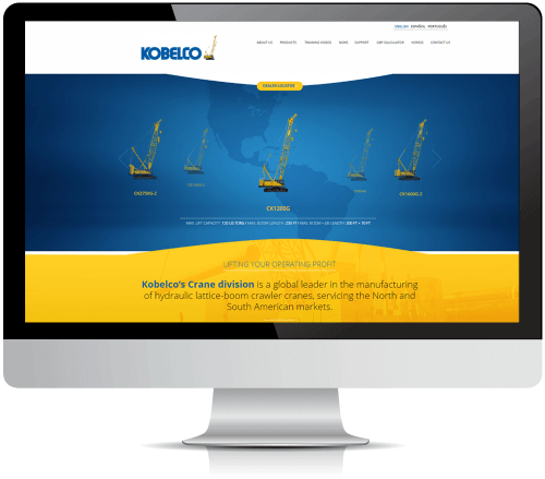
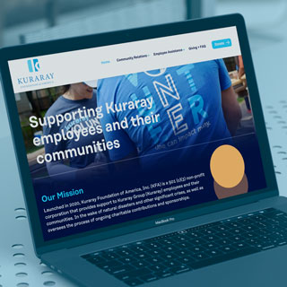
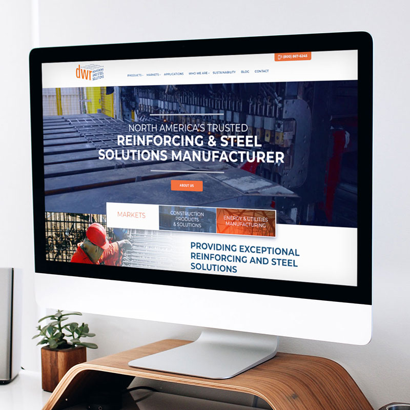
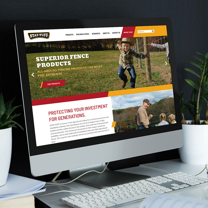
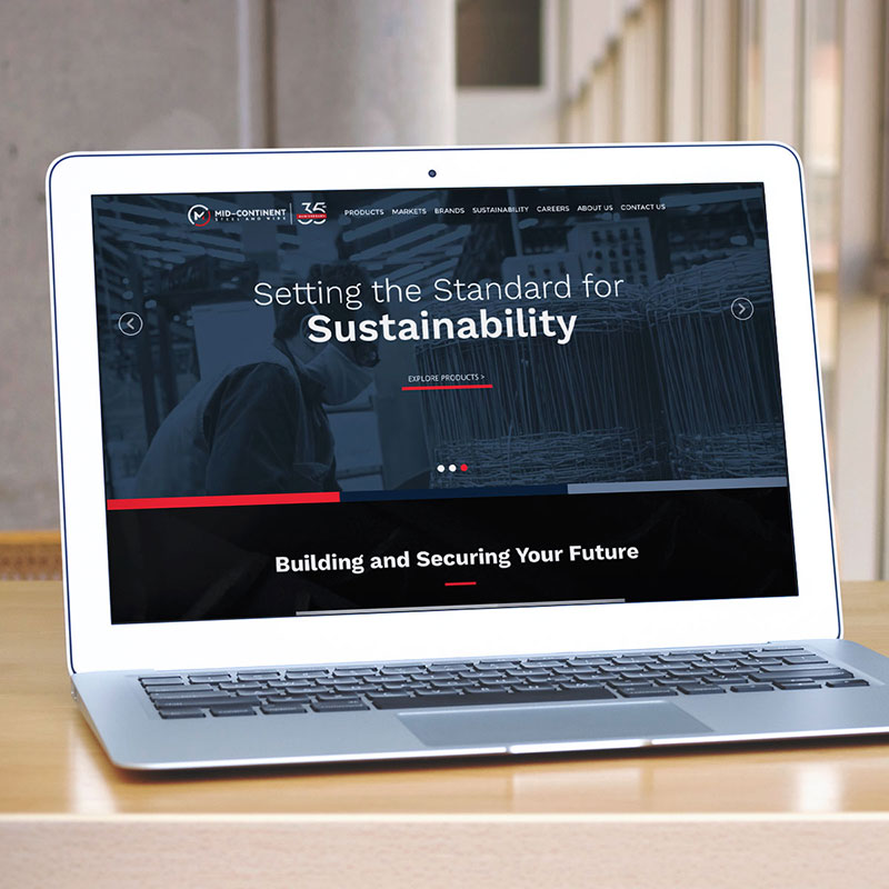
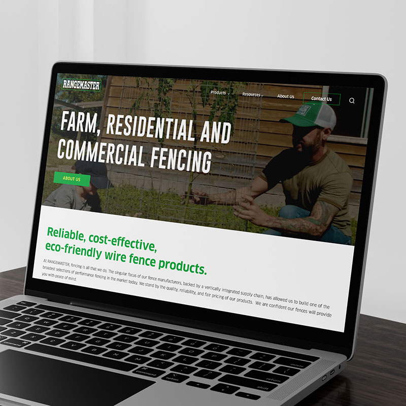
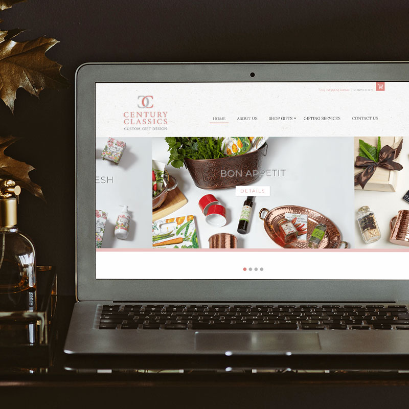
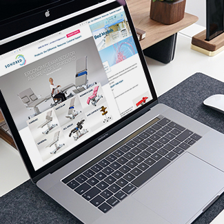
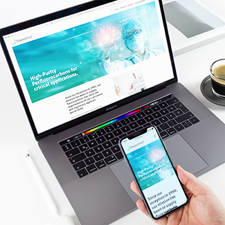
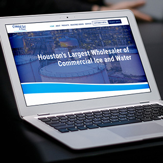
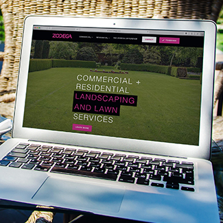
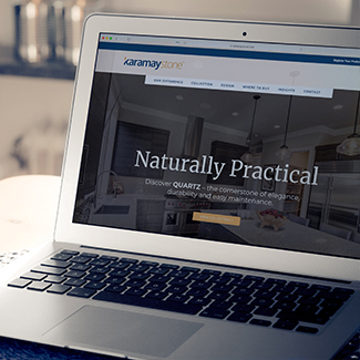
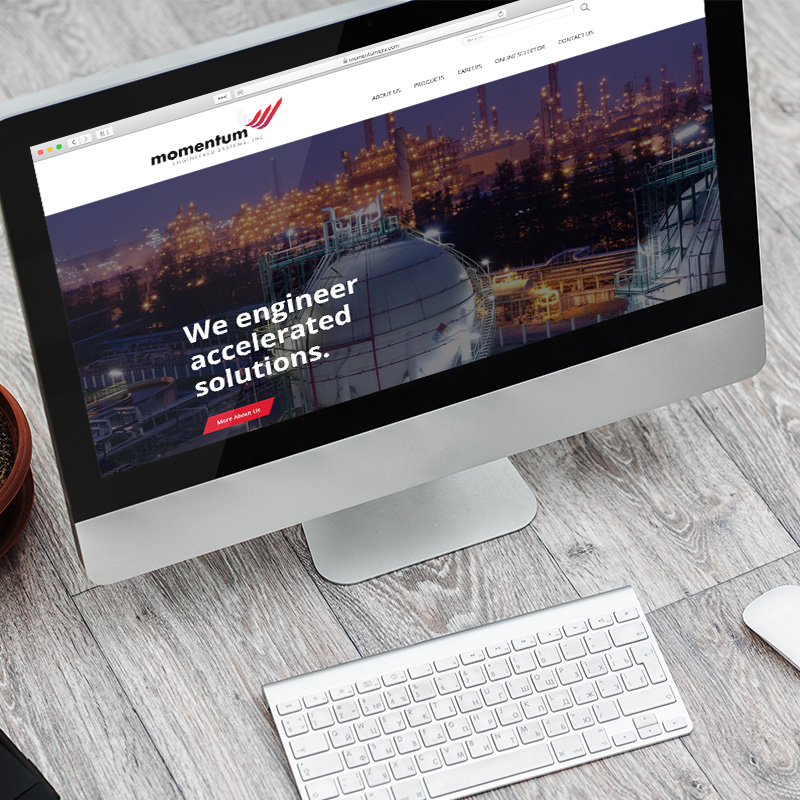
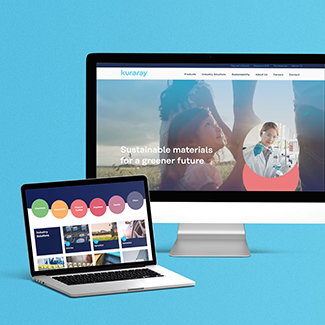
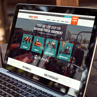
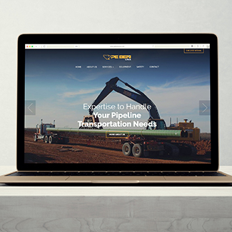
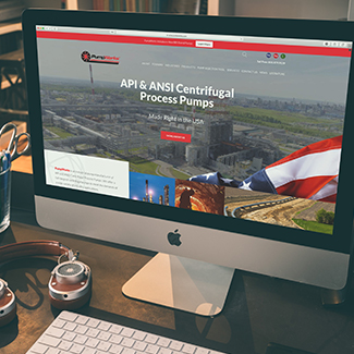
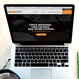
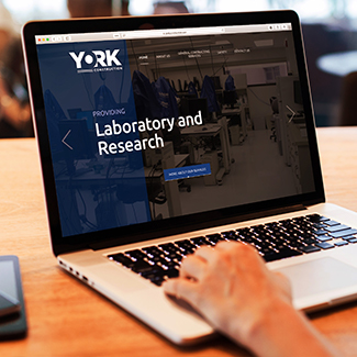
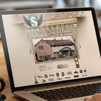
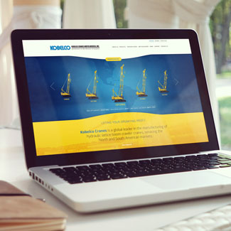
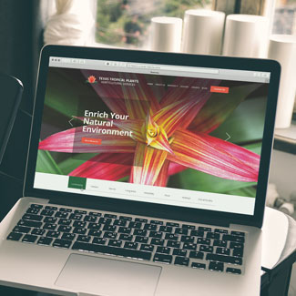
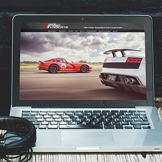
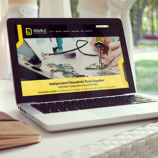
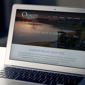
- 4 EXAMPLES OF THE BEST INDUSTRIAL AND MANUFACTURING WEBSITE DESIGNS
- EXAMPLES OF BAD UX DESIGN ON WEBSITES
- 12 BAD WEBSITE DESIGN MISTAKES & HOW TO AVOID THEM TODAY!
- HOW MUCH DOES IT COST TO HAVE A WEBSITE BUILT?
- HOW TO ANALYZE SEO FOR YOUR WEBSITE [WITH A FREE WEBSITE SEO ANALYSIS!]
- WHAT MAKES A GOOD WEBSITE? – EFFECTIVE BUSINESS WEBSITE DESIGN
- HOW TO REDESIGN YOUR WEBSITE WITHOUT LOSING SEO
- WEBSITE HOMEPAGE CONTENT IDEAS – WHAT TO WRITE
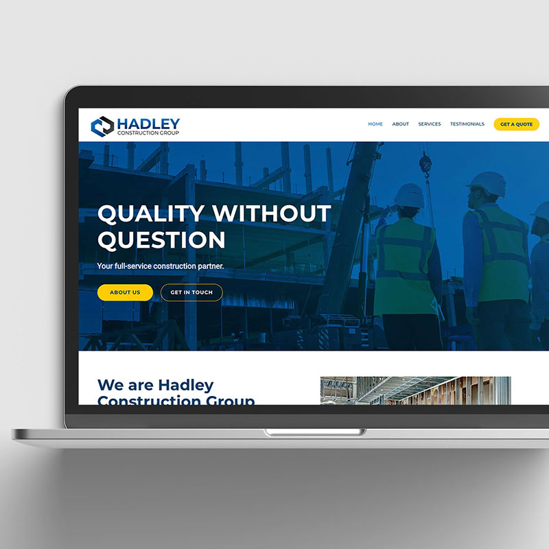
- 9 BRILLIANT B2B WEBSITE DESIGN EXAMPLES FOR INSPIRATION
- MAIN DIFFERENCES BETWEEN UX DESIGN AND WEB DESIGN
- 5 WAYS TO IMPROVE WEBSITE LOAD TIME & BOOST PERFORMANCE TODAY!
- WHY IS MY WEBSITE NOT SHOWING UP ON GOOGLE? – HOW TO GET ON GOOGLE
- UX DESIGN VS. UI DESIGN: HOW ARE THEY DIFFERENT?


What Our Customers Say
"We've worked with several people before MARION and we were so lucky to find them because they got right on the project and we've had nothing but progress since that time. I'm very pleased with them." Genesis Medical Management Solutions
"We've worked with MARION for over three years and we've been very happy with the services they've provided us. They always respond to us quickly, and we're very pleased with what they've done for us." Forum Energy Technologies
"Our impression of working with MARION has been superb. They are creative, strategic, and extremely customer service oriented." Harper & Pearson Company
"I get all my business from my website. It has paid for itself 100 fold." Texas Legal Malpractice
"I wanted to be sure to tell you asap how incredibly gifted you are… the brochures and display are richly poignant and accomplish everything we asked of you in creating these products (and more). We look forward to a long and wonderful association with you and your fine company." DeBakey VA Medical Center
"During IFS’s first year with MARION, we’ve seen an immense increase in web traffic, contacts and most recently inked a $4.5 million dollar deal thanks to MARION’s SEO services." Integrated Flow Solutions
What Clients Say About Our Website Design in Houston
"We've worked with MARION for over three years and we've been very happy with the services they've provided us. They always respond to us quickly, and we're very pleased with what they've done for us."
Forum Energy Technologies
Get a Better Web Design Today!
The first step we need to take is for us to understand your needs, so give us a way to reach out to you and let’s get to work.