The TikTok ban situation in the US involves government concerns about security and privacy, leading to proposed legislation and state-level actions to restrict the app. While TikTok has responded to global bans and made efforts to address concerns, opinions among the public are split right down the middle. As the …


Marketing Strategies Inspired by Spring Training
As the air begins to warm and the sounds of baseball fill the stadiums, it’s not just athletes who are gearing up for the season ahead. While Spring Training is all about perfecting plays and honing skills on the field — it’s also a powerful metaphor for businesses looking to …

March Madness Marketing Opportunities Brands Need to Know
With its widespread popularity and huge fan base, it’s no surprise that March Madness presents a prime opportunity for companies to connect with consumers on a personal level and drive meaningful engagement. In this blog, we’ll share insights into why March Madness is a fantastic business opportunity and provide examples …

How Austin Businesses Can Capitalize on SXSW
For local businesses, SXSW represents more than just a week-long event — it’s an opportunity to showcase their unique offerings to a global audience and capitalize on the influx of visitors to the city. Find out how businesses in Austin can use SXSW to boost their marketing efforts and connect …
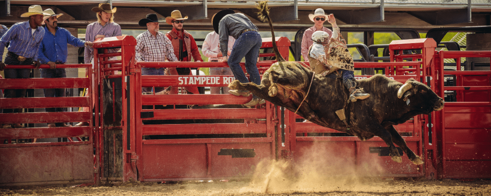
How the Houston Rodeo’s Marketing Ropes in Crowds Year After Year
The heartbeat of Houston reverberates through the dust clouds kicked up at the Houston Livestock Show and Rodeo, an iconic event that consistently ropes in massive crowds year after year. As experienced marketing creatives in Houston, the team at MARION has had the privilege of witnessing firsthand the marketing brilliance …

Analyzing the Most Successful Super Bowl Ads of All Time
Over the years, the Super Bowl has birthed some of the most iconic and memorable commercials in marketing history. Let’s dive into the archives and analyze the most successful Super Bowl ads of all time. The Classics From Apple’s iconic “1984” ad to Coca-Cola’s heartwarming polar bears, these ads have …

How To Write An Effective Corporate Mission Statement (with Examples)
Crafting an effective corporate mission statement is a cornerstone of defining a company’s identity, purpose, and values. It not only communicates to stakeholders, including employees and customers, but also sets the tone for the company’s culture and strategic direction. What Is a Corporate Mission Statement? A mission statement is a …

How to Integrate Awards Season into Your Marketing Efforts
Get ready for the buzz as the 2024 awards season approaches! The internet is filled with anticipation as we unite to celebrate the upcoming nominees and winners in the entertainment industry. The Golden Globes will kick off awards season on January 7, honoring excellence in film and television. The Grammys …

Are Long-Tail or Short-Tail Keywords Better for SEO?
If you’re just learning about keywords and their role in SEO, you may be wondering which ones are better for optimizing your web presence. Let’s dive into the differences between short-tail vs. long-tail keywords. What are Short-Tail Keywords? Short tail keywords are concise, one or two-word phrases that cast a …